top of page
Mirage Visualisation logo

Recently, Mirage Visualisation was ranked second architectural visualization studio in Bulgaria.

We are truly grateful to be included in this list and especially thankful to Artem Tkatchenko for featuring us on Archvizbase.

Video of archviz database

“Believable atmosphere. Calm confidence. Not loud effects.”

These words resonate with us because they reflect something that is rarely visible from the outside.


A good image is never just about the image.

It is about everything that happens before.


It Starts Before the Project Starts

An architectural visualization project does not begin in 3D.

It begins with alignment.

Client acquisition matters. Choosing who we work with matters. Understanding ambition matters.


We build a process before we build an image.

We define responsibilities. We clarify timelines. We structure communication.


Without structure, images become decoration.

With structure, they become strategic tools.


The Kickoff Meeting Is Critical

A strong project starts with a strong kickoff meeting.


We ask:

Who is the audience? What is the maturity of the architecture? What is fixed, and what is still open? When do we receive final files? When is architecture locked? When do we deliver?


Clarity here prevents compromises later.


Many problems in architectural visualization do not come from rendering.

They come from unclear expectations.


Exploration Before Production

Internally, we do not jump directly into production.

We align first.

Especially in competitions, projects are often unfinished.


Our role is not to “make it pretty.”

Our role is to explore.


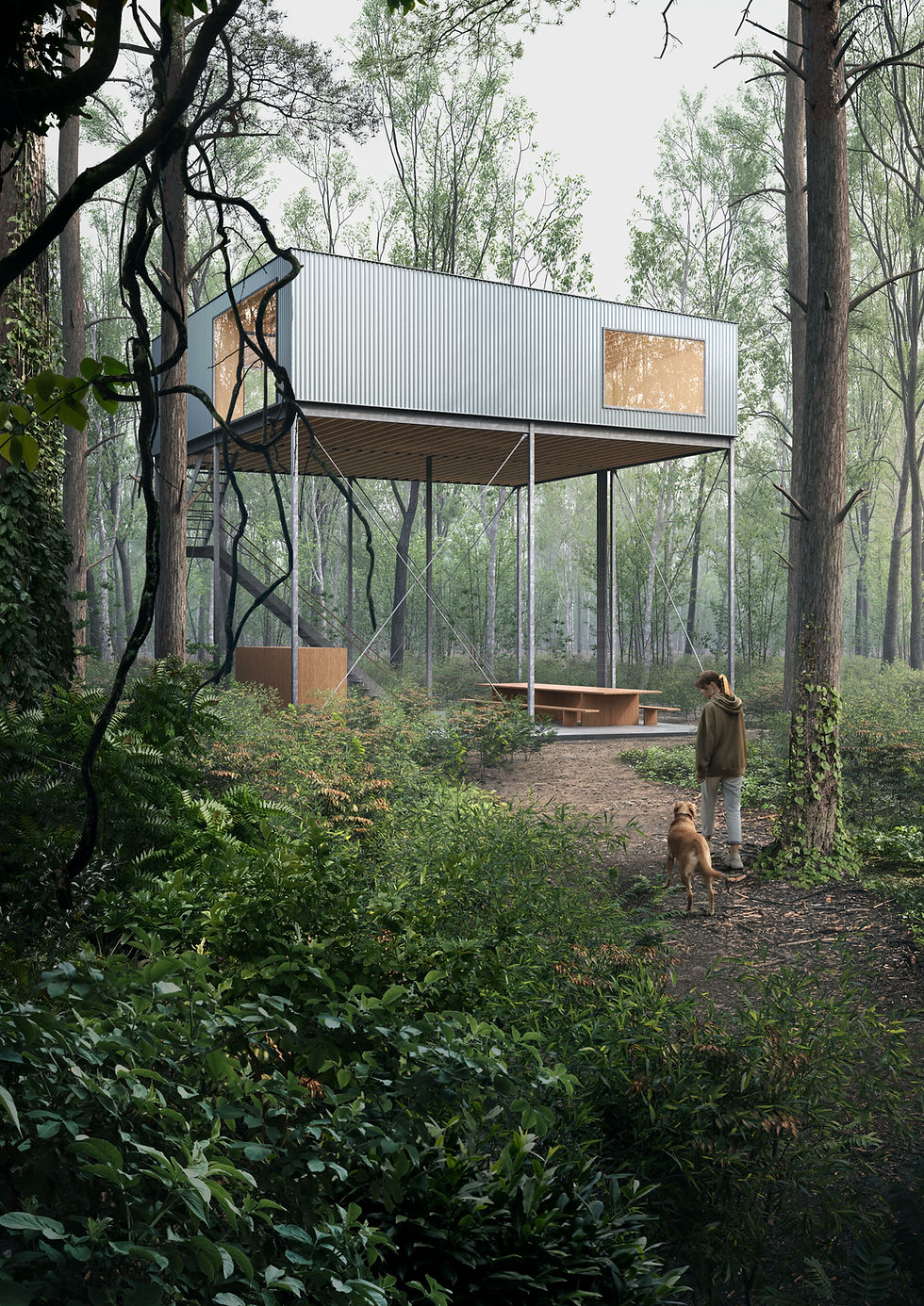
Very often, the first work is not on the building.

It is on the surroundings.

Context.Landscape.Scale.Atmosphere.


Surroundings define credibility.Mood defines perception.


We collect references. Sometimes from the client. Often from our own internal research.

We propose framing. We propose atmosphere. We test perspectives.


This is not decoration.

This is direction.


Improving Without Distorting

At early stages, we are not here to exaggerate architecture.

We are here to understand how it wants to be seen.

In competitions especially, we sometimes see opportunities:

Better relationship with context. Clearer hierarchy. Stronger atmospheric intention.

Our responsibility is not to distort the project. It is to reveal its potential.


Using AI With Discipline

This year, part of our process evolved.


We use AI early, but with precision.

Only for mood testing.


Testing night scenes traditionally requires hours of lighting setup. Only to discover that night is not the right direction.

Instead, we test atmosphere quickly.

Low quality. Fast iterations.Clear separation from the real 3D work.

At the same time, we send medium quality renders of the real model to review:

Materials. Modeling accuracy. Architectural fidelity. Framing.

Ai test : dusk mood
Ai test : dusk mood
Ai test : morning haze

Ai test : after storm

Mood discussions now happen early, when decisions are still flexible.

Not at the end, when architecture is fully detailed and time is limited.


Technology does not replace thinking. It accelerates clarity.


The Image Is Only the Visible Part

When final images are delivered, the project is not finished.

We collect feedback.We analyze what worked.We refine our internal standards.

We follow up on payments with the same rigor as we follow up on pixels.

We plan publications carefully.

Images live beyond delivery. On websites. On social platforms. In competitions. In portfolios.


A good image is not just produced.

It is built through decisions, alignment, discipline, and responsibility.


If our work feels calm, believable, and quietly premium, it is because the visible result is supported by an invisible structure.


That is what stands behind a good image.


For Mirage Visualisation's sixth birthday, we've taken the next step in our journey. Introducing Mirage's brand-new digital look and feel.


Our chosen aesthetic is with a "clients come first" approach.


As you may be familiar, it's Mirage's mission to show the client buildings in the best light possible. Our team creates elegant images that resemble architectural photography.


And just like mirages, they exist for a brief time. Then, the buildings are built; photographs are taken.


But in those couple of moments of time, we take the most effort to create visualisations that are just the right fit for our clients.


We wanted this seamless, elegant vision to be reflected upon our digital identity: starting with our website.


Taking this next step of our journey, we entrusted the help of Simple Graphics, a creative agency that delivers simple, yet meaningful work for clients.


As Thibault Paturle, Mirage's CEO, shares,


"I have followed Simple's work for some time. They seemed to be the perfect fit for our rebranding."

Discover the story today with our exclusive interview with Thibault and Monica Stoykova, Founder of Simple.

Mirage Visualisation's company presentation by Simple Graphics
MV Company Presentation by Simple Graphics

When Mirage Visualisation first contacted Simple, Monica and her team were impressed by the "flawless work of the studio".


"I have always had an affinity for architecture and interior design, and it was exciting to have the opportunity to work with a brand from this industry," shares Monica.


The project was to provide a fresh, new perspective on the current Mirage brand.


With 10+ years of experience in creating minimalistic and timeless designs for brands all around the world, Monika notes that the concept is perhaps the most "exciting, but also challenging and responsible" element.


"That is, as the design concept defines all current and future elements of the brand."

Mirage's and Simple's teams had multiple meetings to find our perfect brand fit.


Thibault recalls, “Simple gave us three design proposals and they were all great. We had a great conversation at the start of the project and these proposals were exactly on point.”


Yet, the three concepts were radically different - we knew that whichever we selected would lead to an entirely different look and feel of the brand.


This was a period of sharing ideas, mutual enrichment, and brand building


And in the end, we settled on a clean and modern vision with a twist.

Mirage Visualisation's business cards  by Simple Graphics
MV Business Cards by Simple Graphics

To follow this concept, the Simple team immediately integrated rules to shape every single aspect of the look and feel of the brand.

  • Starting with font consistency, which had to balance and highlight the essence of the brand. A combination of sans-serif fonts brought about a sense of precision and professionalism.

Mirage's font was also selected to complement our logo: an homage to the pixels that are rendered for each and every single one of our visualisations.


  • Next, the Simple team had to select the color schemes that would best match Mirage's brand.

This includes the classical black-and-white specter.


Those were combined with natural beige hues, symbolizing the natural materials (stone, concrete, wood) used in architecture.


  • One final element which was important for the design was the layouts. Simple's team created those based on a precisely composed grid.

"This eliminates the risk of chaotic arrangement of the elements and structures them in an orderly harmony," recalls Monica.
Mirage Visualisation's letterhead by Simple Graphics
MV Letterhead by Simple Graphics

Speaking about the project itself, Monica notes that the main purpose of it was to create an "invisible" design that won't outshine the work of Mirage.


“The storytelling we see in Mirage is all about visuals, with each image having a different atmosphere and style. All design elements we've used are to emphasize and enhance the emotions of the stories.

On working with Simple, Thibault notes, “I can only praise them, they made the process clear and easy. They were very creative, and their references were great.


More about Simple Graphics

Simple Graphics was founded in 2017 by Monica Stoykova, whose portfolio includes 10+ years of experience working for renowned international advertising agencies.


Today, the Simple team nurtures dedicated creatives, passionate about simple designs, bold ideas, and bringing value to the projects.


With an individual approach to each project, the Simple Graphics team is driven by the desire to create valuable and innovative designs.


Their client base is international and covers multiple niches - from beauty brands, through government institutions, to technology and innovation brands.


bottom of page